Appearance
Faithful Branding Guidelines
A non-exhaustive handbook to use our branding effectively.
Faithful is a community project that's not meant to be taken too seriously. Our branding, however, was made with certain goals in mind. If you're into this sort of thing and want to represent Faithful properly, we'll be extra grateful if you follow these guidelines.
Do remember that our license still applies when using our branding. This means that you cannot use our branding with the intent to confuse users into believing an unofficial project is official.
Finally, you can find all our branding assets on our GitHub repository.
Part 1: Language
Faithful is the product of the community. If a community you rely on cannot understand you, that's a problem.
This concept basically boils down to not using unnecessarily formal language. Certain settings may require more or less formal language than others (e.g. licenses and guides should be more professional than regular posts), but if the average person doesn't understand what you're talking about, you either need to add in some definitions or simplify your language a bit.
Good:
Classic Faithful 32x goes all out on nostalgia!
Bad:
Classic Faithful, formerly named the Emulated Vattic Textures or "EM" project, attempts to answer the question "what if Vattic had never left Faithful".
To refer to the project as a whole, "Faithful Resource Pack" is preferred when Faithful hasn't been already introduced. Once the Faithful name has been established, you can simply use "Faithful" from then on.
For specific projects, use (division) Faithful (resolution)x (style) as the format for each specifier.
Good:
- Faithful Resource Pack
- Faithful 32x
- Classic Faithful 32x
- Faithful
Bad:
- Faithful x32
- Faithful Classic
- Faithful32x32
- faithfull
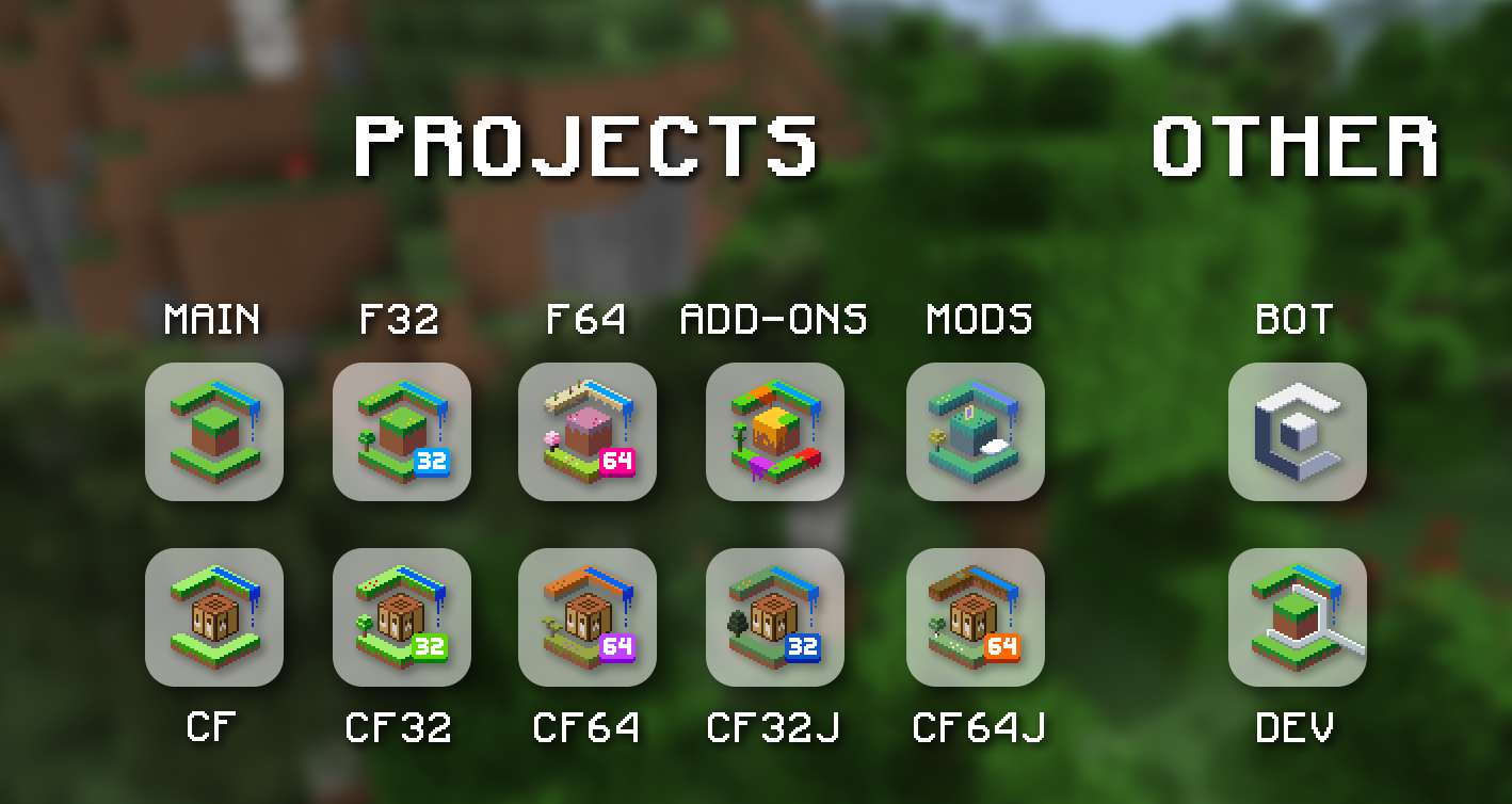
There are also abbreviations for each project, although it's not recommended to use in user-facing UI since they can be hard to understand:
Common Project Abbreviations
- Faithful 32x: F32
- Faithful 64x: F64
- Classic Faithful 32x: CF32
- Classic Faithful 64x Jappa: CF64J
- Classic Faithful (the whole project): CF
Finally, for Faithful Add-ons, never capitalized "ons" (Add-Ons) or write the word without a hyphen (Addons).
Part 2: Logos
Logos work well for displaying our branding in places with limited space. This includes, but is not limited to cards, thumbnails, and buttons. Don't use our logos as a substitute for showing the name "Faithful" itself, but use them when the name is already established instead.
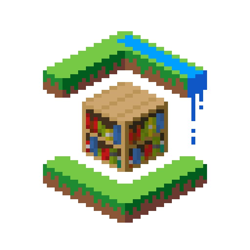
For most general-purpose applications, use our main logo. This logo additionally encompasses Classic Faithful, but if you specifically want to refer to Classic Faithful, you can use its respective main logo as well.
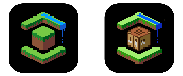 Left: Main logo. Right: Classic Faithful main logo.
If you only want to refer to one project, such as in a card, use that project's respective logo.
You can use a monochrome version of our logo in small spaces if using the regular logo would look visually noisy or be hard to read.

Project logos should always retain their pixel art form—don't simplify the shape into vectors.
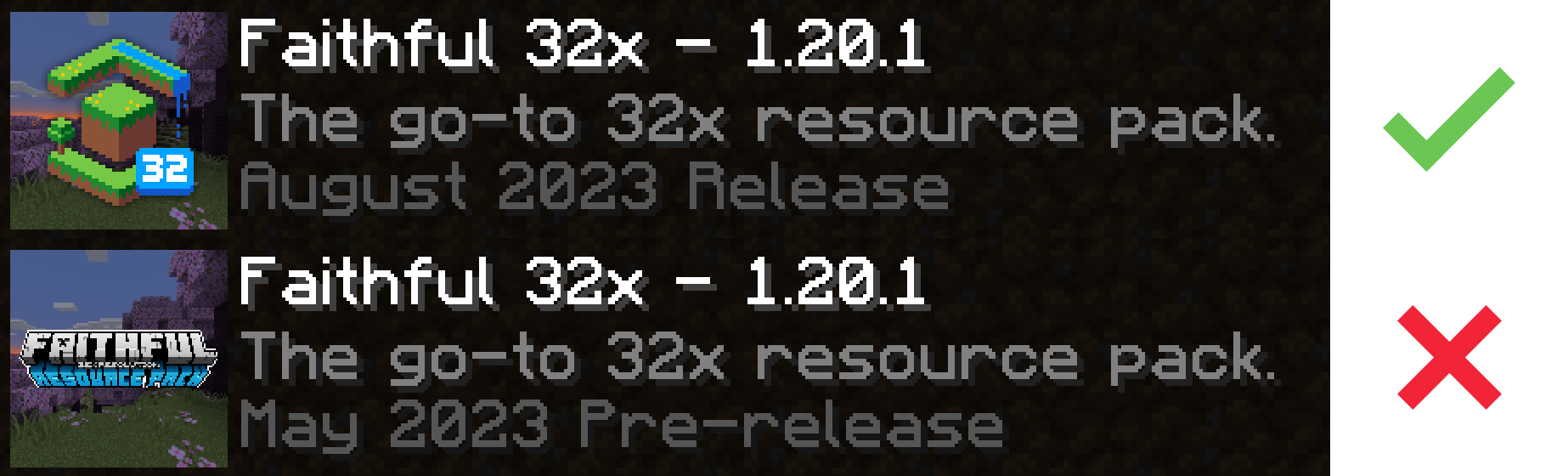
 Left: Correct depiction of the Faithful logo. Right: Incorrect depiction.
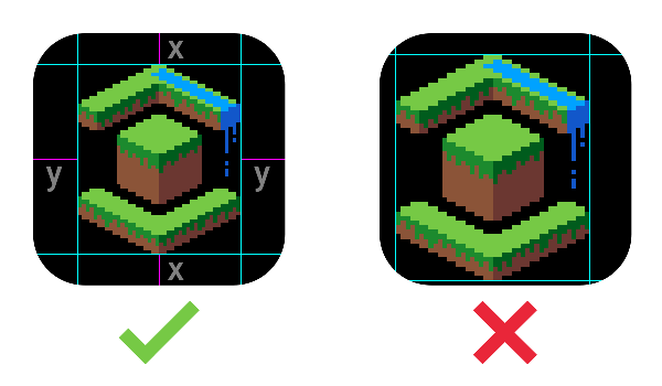
Finally, our logos should always be centered based on their main hexagonal part. The numbers and symbols in the bottom-right corner should not be taken into account when positioning.
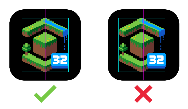 Left: Correctly centered Faithful 32x logo. Right: An example of incorrect centering; Note that the logo on the right has been centered based on the whole image, and not just the hexagonal part.
Part 3: Wordmarks
Wordmarks tend to be pretty big and bold, so use them sparingly for large banners and other big areas. They're usually the preferred branding when placed over busy backgrounds such as screenshots.
 The Faithful banner.
The plain Faithful wordmark is preferred for most purposes, but specific projects also have their own wordmarks, similarly to the project logos.
In addition, both cracked, flat, and outlined versions exist. As a rule of thumb, use the flat versions for referring to Faithful (or Classic Faithful) as a whole, the cracked versions for specific projects, and the outlined versions to help readability when necessary.
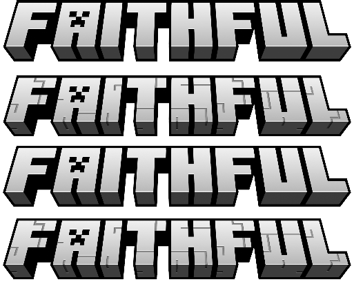 Each Faithful wordmark variation.
Wordmarks don't tend to scale well, so refrain from using them in small spaces—consider using the logo or simply typing out the name when space is limited.
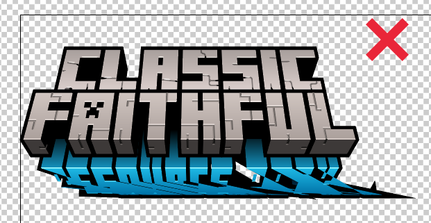
 An example of a wordmark not scaling well.
Most importantly, don't mix logos and wordmarks, since the pixelated logos don't mix well with the high-resolution wordmarks. Instead, only use one or the other—write out the name elsewhere if you're using the logo, or completely remove the logo and only use the wordmark.
 A logo next to a wordmark.
Part 4: Typography
Download the Faithful fonts here
The Faithful 32x font is the main typeface for headings, tooltips, form controls, and buttons. For large areas of body text or very small text, Roboto can be used instead, as raster type doesn't scale well at small sizes. For more interactive websites, such as the Faithful Web Application, Roboto can be used for other purposes to increase legibility and consistency as needed.
To add additional emphasis to text (such as multiple levels of title or a key statistic), use the semibold variant of the Faithful 32x typeface. Refrain from excessively using the full bold variant, as it has a large horizontal footprint and can be hard to read at small scales.
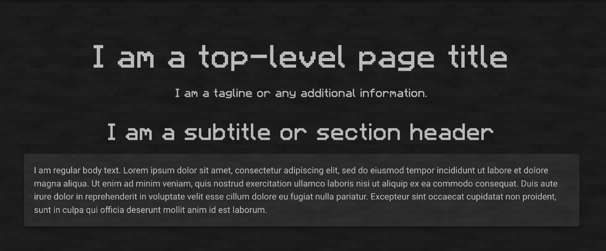 Each font weight and where it should be used.
Part 5: Scaling
In general, the hierarchy of branding elements to be used should be (from largest to smallest space available) wordmarks, then logos, then regular text.
Always leave padding around the edges of any logo and wordmark. For logos, try to keep the padding such that the logo image is always displayed as an integer multiple of 64x64, since that minimizes pixel distortion when rendered on low-resolution screens.
 Left: Correct padding and scaling of the logo. Right: Incorrect padding and sizing.
Don't distort our branding to fit in a given space. Instead try using another suitable image or simply typing out the Faithful name using the format specified in part 1.
 Do not.
Part 6: Colors and Backgrounds
Faithful has a fairly limited color palette used throughout most of the branding, and a set of background images to complement them.
The main brand color is used for most accent colors, such as buttons or embeds. It works in combination with the "generic" background image.
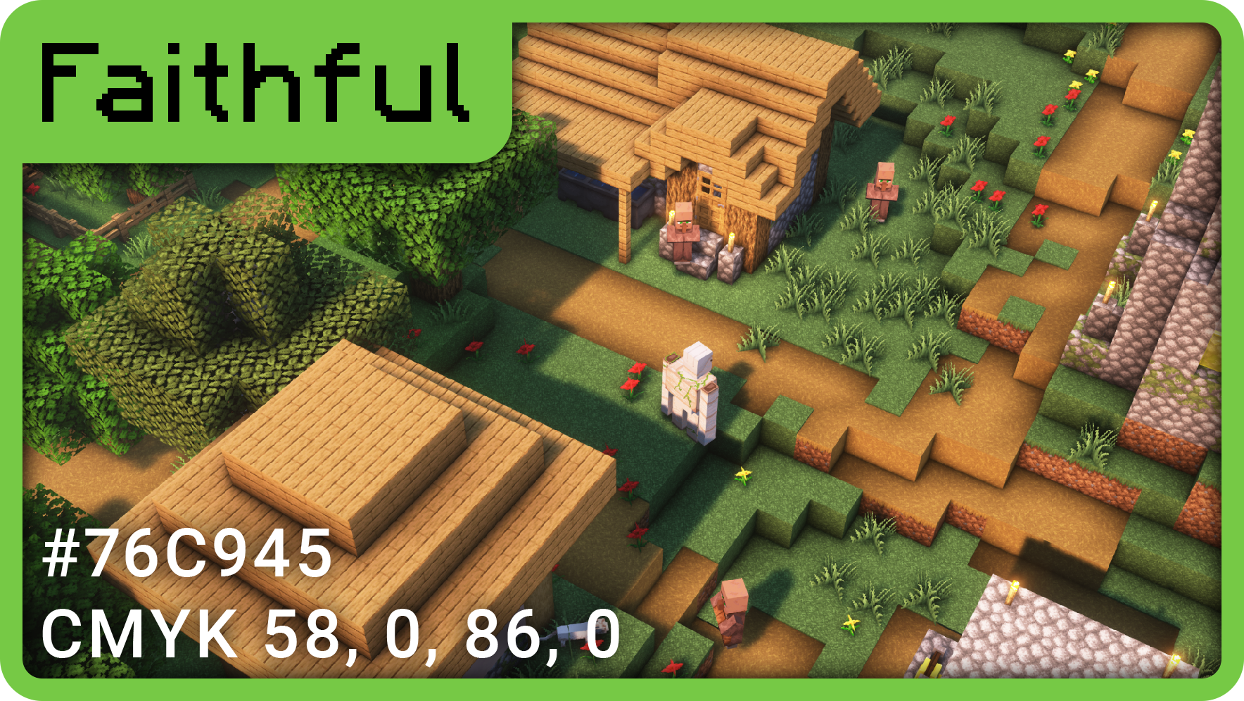 The main Faithful brand color and image.
Each pack additionally has a unique color and background screenshot assigned to it.
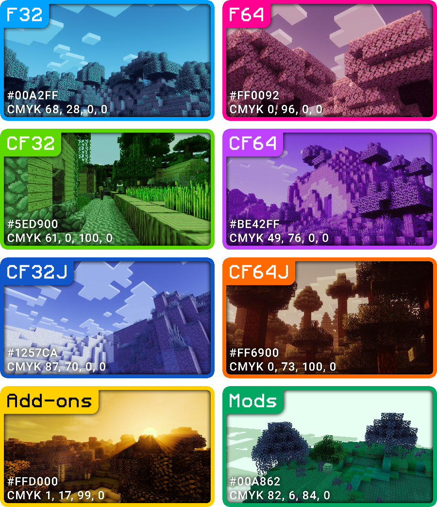 All Faithful project colors with their respective images.
A background image works well with a wordmark, decently with a logo, and not as well with written text. This placement hierarchy should be used to determine an element to go on top of a background image. If you absolutely have to use a logo or text on a background image, it is recommended to add a drop shadow and/or blur the background.
Conclusion
These guidelines probably look very different to your standard 50-page corporate brand guidelines with every single use case laid out, and that's because at the end of the day, as long as you're getting your point across and aren't confusing anyone, it's probably fine. We aren't fussed if your padding is a few pixels off, or if you're using the wrong font size—just don't be horribly inconsistent with everything else and that's about it.
As with all our docs, if you have any suggestions leave them on our Discord server. Good luck with whatever you're doing!
Credits go to…
- Evorp (content, some images)
- Pomi108 (images and some content ideas and edits)
- Klonoa (an image)