Appearance
Faithful 32x Texturing Guidelines
Introduction
Faithful was meant to be a love letter to the artists that created the world of Minecraft. In doing a default style resource pack such as this, we pay respect to the art by following the design philosophies made by JAPPA in order to maintain Faithful.
But since the pack was premised primarily on community contributions, the risk of inconsistency in the art loomed over us. We figured that with a set of rules or guidelines, these inconsistencies could be reduced and allow the pack to flourish.
Initially, we tried to have minimal, ambiguous guidelines so as to not limit people’s creativity too much, in the hopes that artists would stick to approximately the same style. This proved to be too optimistic, and as the pack expanded, textures with increasing degrees of stylistic variety were added, hindering the overall consistency of the pack.
Whenever a texture that was borderline rule-breaking was made, it always led to controversy and a huge debate that would drag on for hours, and would never come to a clear conclusion.
The truth is, nobody really expressed a clear enough idea on what the pack’s style should be, nor were the preceding guidelines ever enforced heavily.
These new rules and guidelines aim to fix all of these problems, and will try to outline Faithful's stylistic direction with as much attention to detail and as much clarity as possible.
TIP
Many texturing and Faithful-specific terms are referred to throughout these guidelines. Make sure to read the Faithful Texturing Glossary if you run into any terminology you're unfamiliar with.
Part 1: General Rules and Tips
Rules
These requirements apply to all textures unless specified otherwise and must all be met for a texture to be considered viable for Faithful.
Textures need to mimic vanilla Minecraft textures, and should be heavily based upon them. This probably goes without saying, but it’s good to have it specified nonetheless. While you are not required to make your texture by directly editing the vanilla one, it is heavily recommended and usually helps your texture look better and closer to the default texture.
Outlines, dividing lines and the like that would end up being 2 pixels wide when upscaled to double the resolution should almost always be 1 pixel wide. Pretty straightforward; most lines in Faithful should be 1 pixel wide (examples: glass, gold block, iron ingot, diamond). There are exceptions to this, especially if a line is not an outline/dividing line and/or is curvy, or would be off-centre if it was 1 pixel wide—in these cases it’s acceptable to make the line wider.
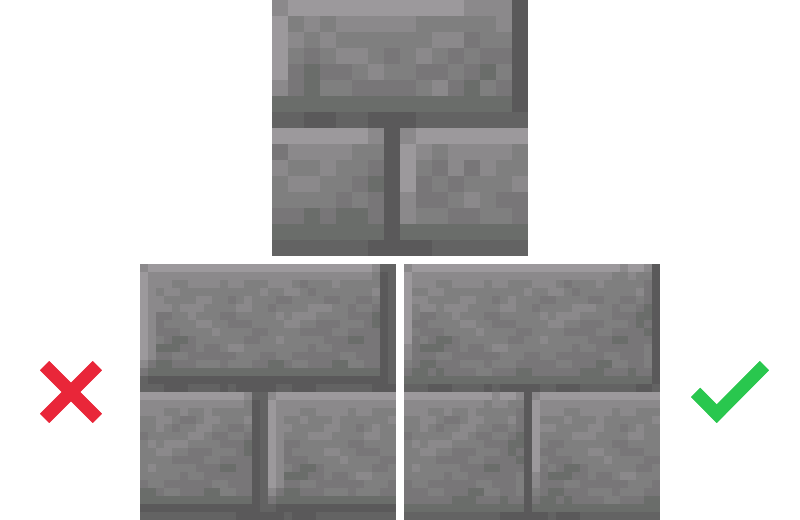 Top: Vanilla texture. Bottom left: Improper interpretation of lines present in the vanilla texture. Bottom right: Better interpretation.
- All textures are required to be shaded correctly according to their material and shape. Before shading a texture, define its material correctly (rough/smooth, shiny/non-reflective), and then use adequate shading methods. These are further described in the Material and Shape Reference List.
 Left: Incorrectly shaded item (see the Material and Shape Reference List). Right: Correctly shaded item.
- All elements of a texture need to have their meaning, and should look like actual things instead of just shapes. Don’t just mindlessly upscale textures without paying attention to what they’re supposed to represent: When drawing an element of a texture, always think about what it’s supposed to represent in vanilla, and then draw the element according to this idea (while still keeping similarity to vanilla in mind, of course).
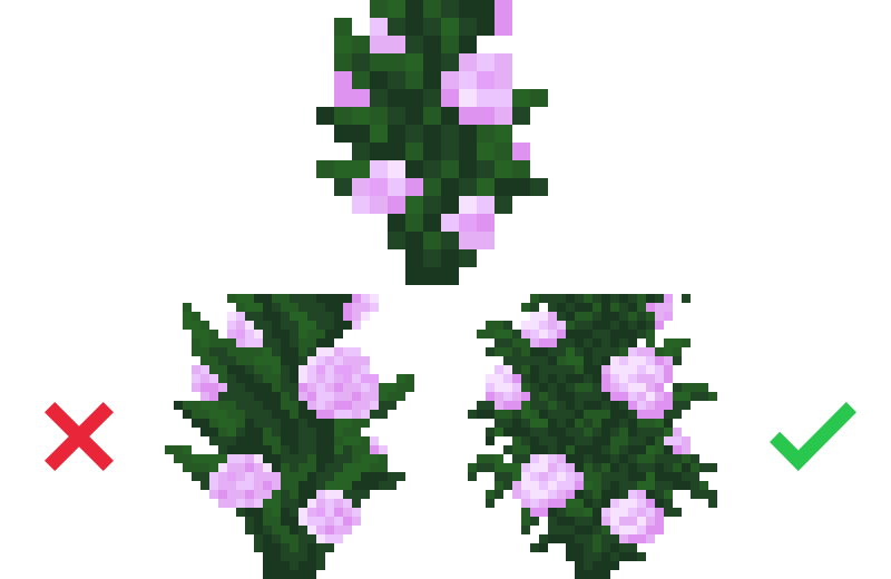 Top: Vanilla texture. Bottom left: Incorrect upscale. Bottom right: Correct interpretation (note the individual leaves, which are required in double the resolution but aren’t possible to be depicted in the vanilla resolution).
Textures should stick to the vanilla colour palette. Self-explanatory; try to only use the colours that the vanilla texture uses. If you’re trying to blend two colours together using anti-aliasing, you can usually re-use a colour from elsewhere in the texture. In difficult circumstances you can add colours to help you, but most of the time, one or two is enough. If the texture you’re upscaling already has many colours, you can use that to your advantage, but you should still keep the palette limited to more or less than 10 colours. Additionally, never change existing colours from the vanilla palette! If a vanilla texture uses 5 specific colours, make sure your texture uses these exact ones.
This rule does not apply to animated textures that used to be generated procedurally in the past: e.g. water, lava, nether portal, fire and soul fire.Do not make up features/details that are not clearly present in the vanilla texture and don’t add them to your texture, unless not having them makes absolutely no sense in double the resolution. While upscaling a texture, one might have the tendency to add significant elements that are not present in vanilla. This is discouraged, as it makes a texture look too distant from the vanilla look most of the time. This also applies to various details in a texture: If appropriate, a normal amount is encouraged, but don’t overdo it.
 Top: Vanilla texture. Bottom left: A texture with too many added details. Bottom right: A texture with just enough details and features.
- When blending colour using anti-aliasing or dithering, make sure that darkest colours never directly border the lightest ones and vice versa. Dirt is an example of this. Always have a transition colour in between the colours. In some cases this is desired, but not in many. If you’re a beginner Faithful contributor, always follow this rule.
 Left: Improper colour borders. Note the very harsh-looking colour borders caused by the lack of a transition colour. Right: Correct colour transitions.
- Try to eliminate colour banding, if possible. This can be done by cleverly reducing the width of each colour band to one or two pixels. Don’t brute force it though, since in some cases where the colour palette is especially limited this can harm the texture overall. It’s certainly possible to do in most cases though.
 Left: An example of a texture with noticeable colour banding. Right: The same texture, with colour banding mostly eliminated.
Unless it’s intentional and makes sense to have, there should never be large single-colour areas in your texture. This applies especially to raw materials like stone or wood. You can always break these areas up by using dithering or other methods.
Noise that was clearly generated using a filter is only to be kept if removing it would alter the general look of the texture too significantly. If noise is upscaled, its palette should be reduced to a minimum.
 In this particular texture, the noise is contrasty and visible enough to be kept and upscaled.
 The shulker box is an example of a texture where the noise is barely visible, and therefore should be removed.
- If a texture uses another texture as a base, use the already existing Faithful rendition of it, if available. An example of this would be stone and ores. Don’t make stone from scratch just for the ore texture. Make your life simpler and re-use existing textures when you can.
 An ore texture. Note how the already existing stone texture is used in the background.
If a texture would end up looking identical to vanilla when upscaled (while following all the above rules), it shall not be included in Faithful. Self-explanatory. Textures like these look exactly the same as vanilla when used in-game, and so they only bloat the pack and needlessly increase the file size.
If a texture has issues noted on the Mojira website, Mojang's offical bug tracker, then changes should be made to fix them. Some examples of bugs that are allowed to be fixed include unused/misaligned pixels or textures, “Jappafication” errors, and parity issues. Fixing bugs allows for the pack to have issues in textures resolved before they are added into the base game, which saves us time.
NOTE
Special rules and/or exceptions can apply to specific textures if the Art Director Council approves it.
Tips
- Mob faces can be particularly hard to interpret in only double the resolution. If all attempts at upscaling the face end up looking bad, it is acceptable to use a “mixel-face”—just keeping the vanilla mob face, without any edits, on an upscaled background.
 An acceptable mob face.
- Dithering should not be overdone, unless you’re re-drawing a particularly noisy texture (e.g. sand). Also while dithering, try to avoid lone pixels, as in the ones that do not border other ones of the same colour.
 A close-up of a colour transition with lone pixels, which should be avoided.
- Try to minimise the occurrence of stairing pixels, an example of which is shown below.
 Left: Example of a colour transition featuring stairing pixels. Right: The same transition, with the stairing removed.
And most importantly...
Always get feedback from others while drawing a texture! It will help you improve in ways you wouldn’t even have thought of.
Part 2: Material and Shape Reference List
This section goes into detail about how to draw and shade specific materials and shapes.
Materials
There exists a correlation between the roughness and shininess of a material and the colour blending method. Generally, the rougher a material is, the more dithering you should use. The same applies to high-contrast colours and minimal colour blending for shiny materials.
Smooth metal should only use anti-aliasing as a colour blending method, or no blending at all. The colour palette should be limited and contrasty. In some cases mild linear dithering is acceptable if it’s required to keep the texture from looking like plastic. Additionally, in item textures, faces of an object which are in the shade should have a lighter outline (as well as the item outline itself) to simulate light reflection.
 Examples of various smooth metal textures.
Rough metals such as raw ore blocks, netherite, anvils, and even iron golems should follow the same lighting logic as regular metals while being dithered. While regular dithering should be the preferred method, small amounts of linear dithering can be used as well.
 Examples of rough metal textures.
Diamonds and other gemstones in Minecraft’s context should be shaded like reflective rocks more than anything—they usually don’t let much light pass through, unlike their real-life counterparts. Only anti-aliasing should be used here. For faces in the shade in item textures, the same shading logic as on smooth metal textures applies.
 Examples of gemstone textures.
Contiguous stones that are not broken up into smaller rocks are very rough, so they should use dithering as much as possible. For textures with a linear pattern (stone, dripstone), it is recommended to use a mixture of linear and regular dithering to emphasise the material even more. Anti-aliasing can be used here, but only when the material is smoother than usual, like with dripstone.
 Examples of contiguous raw stone textures.
Polished stones should use dithering (linear when applicable) a bit, but not nearly as much as raw stones. Instead, anti-aliasing should be used in heavier amounts to express the smoothness of the material. Smooth stone is a special case however, as it directly reuses regular stone’s texture pattern (which you should do as well, as per rule 11).
 Examples of polished stone textures.
Rocky materials such as cobblestone and netherrack should be dithered as much as raw stones, but unless the rocks are arranged in a clear linear pattern (like in the deepslate texture), linear dithering should never be used.
 Examples of rocky material textures.
Wood should use a lot of linear dithering and very minimal amounts of regular dithering. To smooth colour transitions, anti-aliasing can be used if it looks good.
 Examples of wood textures.
Most flowers, foliage, and other plant matter can use dithering (linear or regular) depending on the general roughness/smoothness of the surface. While flower petals can employ this shading method, genuine leaves should never use dithering.
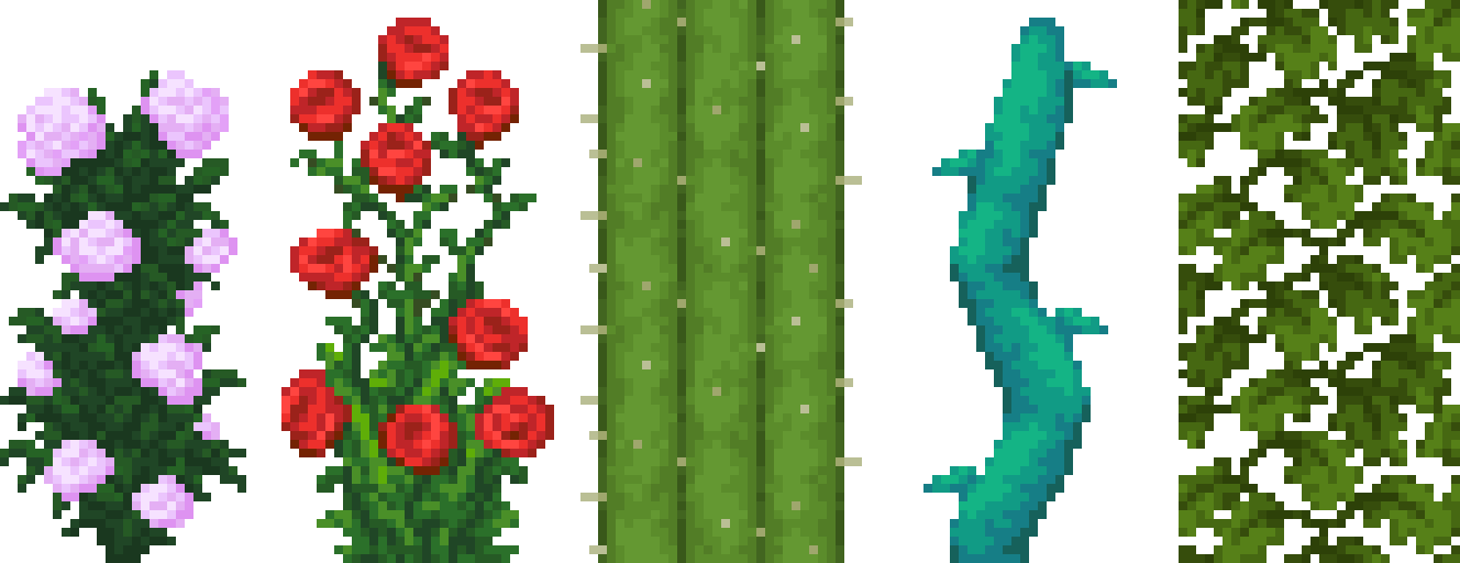 Examples of plant textures.
Corals should mainly use anti-aliasing, but regular dithering is also acceptable.
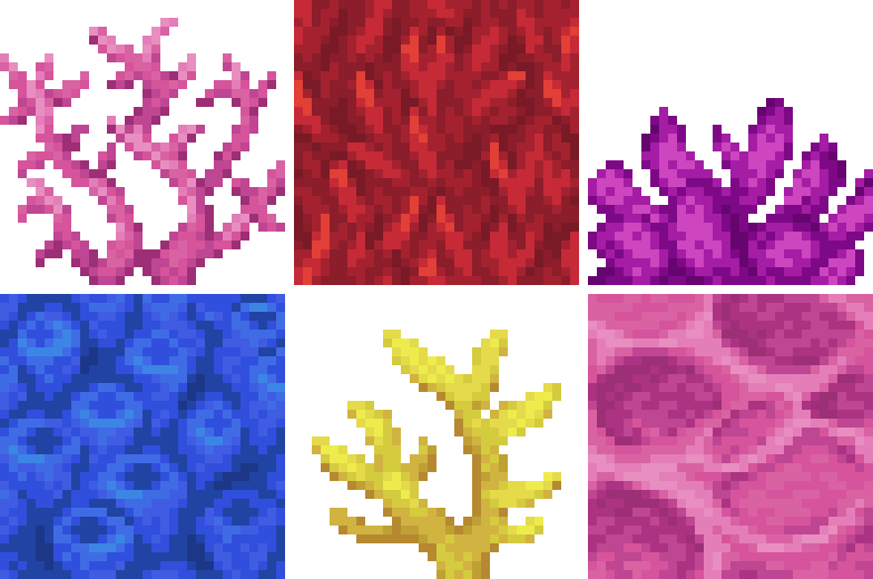 Examples of coral textures.
Sand and other powdery materials should be heavily dithered: there should be no large contiguous area of a single colour. Even checkerboard dithering can be used in this case, in small amounts. Anti-aliasing is encouraged to a smaller degree. This also applies to gravel, where the individual rocks that make up the material are clearly visible.
 Examples of powdery textures.
Bee nests are to be shaded the same way wood is.
Honey and slime should not feature any dithering at all, only using anti-aliasing to smooth the colours.
Glazed terracotta should only use minimal amounts of anti-aliasing when required, otherwise no colour blending should be present.
 Examples of glazed terracotta textures.
Glass can use small amounts of dithering for the frame. This does not apply to items.
Bones (including skeletons) should ideally mainly use anti-aliasing, with a bit of occasional linear dithering sprinkled in, near colour transitions. This applies to tusks as well.
 Examples of bone textures.
Cloth and paper should both be shaded approximately the same way, with the only difference being that cloth should have more linearity. Anti-aliasing should be the main colour blending method for these materials.
Skin (in mob textures) and leather should mainly use anti-aliasing. Not using many colour blending methods can lead to heavy colour banding and looking plasticky, so this is a reminder to try and eliminate that if possible. Depending on the roughness of a specific skin type, linear and regular dithering can also be used to communicate the feel of the material.
 Examples of skin textures.
Creepers are quite mind boggling. The texture was originally made from the leaves texture used in Alpha, but since a lot of noise has been overlaid on top, the texture no longer looks anything close to leaves, not to mention Alpha leaves barely resemble leaves in the first place. Basically, nobody knows how to shade this chaos of a material properly, so we just indexed the texture and used a combination of all the techniques listed here to create a chaotic material that doesn't really represent anything. Worked surprisingly well.
Fur and hair should employ linear dithering, but in such a way that it creates visible strands of hair. Some regular dithering and anti-aliasing can also come in handy. This applies to wool on sheep as well.
 Examples of fur/hair textures.
Fish entities should have clearly visible scales present where appropriate (don’t just draw a checkerboard!). Basically all colour blending methods can be used here.
 Example of a fish texture.
Shapes
Cylindrical type objects such as iron bars, individual dynamite sticks that make up TNT, and metal railings should have visible shades along both sides and a highlight on the side near the centre like so:
 An example showing how to shade cylindrical type objects.
Part 3: Fixing JAPPA’s Mistakes and Things He’s Forgotten
Faithful extends its field of expertise to correcting JAPPA’s mistakes. One such example would be the observer texture:
 JAPPA's observer top texture.
It is obvious that this texture uses the programmer art furnace cobblestone in the background. This is not viable for Faithful, as the pack strives for consistency, and as such it has been decided to use the already existing furnace cobblestone texture instead. Besides the observer, many more textures requiring this treatment exist. Some uncertainties about this have emerged over time, so a specific rule has been made:
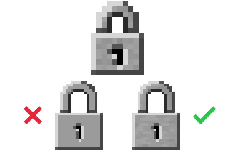
Only replace programmer art textures (or textures that weren’t changed in the texture update) if it’s absolutely obvious what they should be changed to.
Let’s take the observer texture mentioned above as an example. It is clear that it uses programmer art textures with very little modifications, and even when these edits exist, they’re simple overlays. Thus, this process can be replicated with the Jappa cobblestone in order to make a viable Faithful texture.
On the contrary, a texture that should NOT be “Jappafied” is blaze powder. The number of colours and the shading style make it clear that it was not made by JAPPA, meaning that it can be classified as programmer art. One might think of trying to re-interpret the texture using the art style present in other item textures by JAPPA, but one major problem arises: there is no obvious way to do it correctly. What colour palette should be used? How contrasty should the colours be? Should the shape be preserved? Would the same shading methods be kept? Nobody knows for sure, and these assumptions are not for Faithful artists to make. As such, this texture, and all the other textures that fall into this category, are to be left as-is, and should be upscaled like any other texture according to the rules mentioned above.
 Blaze powder, an example of a texture that should not be “Jappafied”.
Conclusion
Wow, this turned out way longer than we expected it to be. Would you believe that these guidelines were over a month in development? Well, we hope that you have found them useful and descriptive, and that they have cleared up any misbeliefs or doubts you might have had. If you have any questions, want to give feedback for this document or just post your textures, message us on our Discord server!
Final Note
These rules and guidelines are subject to change at any time. Significant changes to this document will be announced publicly.
Credits
- Written by Pomi108 for use in Faithful
- Edited by Anonymous, Juknum, and Fred figglehorn
- Images compiled by Anonymous and Pomi108
- Credit for images goes to various Faithful contributors, Mojang Studios, and Google Images