Appearance
Classic Faithful 32x Texturing Guidelines
Introduction
Classic Faithful was made as a tribute to the original creator of the Faithful 32x32 resource pack, Vattic, and to all his hard work to build the Faithful community to what it is now, all the way back when it was just one person running everything.
Initially named "Emulated Vattic Textures", or "EM" for short, the pack was designed to fix the stylistic shift that came under the leadership of Kraineff and later the Compliance / Faithful Administration. The main Faithful pack's art direction shifted to something quite different to the original work Vattic had made, opting instead for a much more detailed, modern style to go along with the new textures the texture artist Jappa had made starting versions 1.14 inclusive. However, this style completely replaced the old one with no real alternative for those who preferred the old style. This is where we come in, as the spiritual successor to Vattic's Faithful, maintaining the original style of the packs.
However, contributions ended up being few and far between even though the project was intended to be community run and managed similarly to the main Faithful packs. This was both due to the project never being the main focus of Faithful, and the rapidly increasing and changing standards deterring anyone who wanted to try. Contributors had to walk the very tight line of achieving the same look and feel of Vattic's original work while maintaining Jappa's newer ideologies more reminiscent of traditional pixel art, which was no easy feat. As well as this, when a programmer art variant was started later on, contributors had to learn how to deal with excessive palette sizes and a number of other issues that plagued the original textures, while also upscaling using Vattic methods. All of this contributed to the project always being somewhat inactive and usually one to two people doing all the work for any given pack.
These guidelines are designed to formalize the unspoken procedures that were formed over time to recreate Vattic's style today, and to lay down some actual instructions for any aspiring artists rather than vague advice that rarely works.
With all of that being said, let's start with the basics.
TIP
Many texturing and Faithful-specific terms are referred to throughout these guidelines. Make sure to read the Faithful Texturing Glossary if you run into any terminology you're unfamiliar with.
Part 1: General Rules and Tips
Rules
These requirements apply to all textures unless specified otherwise and must all be met for a texture to be considered viable for Classic Faithful.
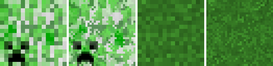
- Textures need to follow vanilla Minecraft textures whenever possible. This should go without saying, but textures have to keep the same proportions, general coloration, and representation as vanilla. A good rule of thumb is to check how the texture looks from far away compared with vanilla; the less difference, the better.
 Right: A texture with vanilla color placement, proportions, and overall structure. Left: Its vanilla counterpart.
- When applicable, always reference Vattic's art. Another self explanatory one given the entire purpose of the pack. If the texture has a programmer art equivalent, or just generally fits into a similar material as one, always reference Vattic's original art when drawing textures. Not only does it make texturing much easier, but it also helps keep the stylistic cohesion of looking like Vattic's original Faithful 32x32.
 Left: Vattic's bricks. Right: Its Jappa equivalent.
- With detailing, less is more. Don’t overdo dithering or antialiasing, instead use the minimal amount of detail to keep textures from looking flat or ugly. Always ask yourself "could Jappa have done this in a 16x canvas" before adding additional detail; if large details are not present in vanilla there's probably a reason for it. If something genuinely could not fit in the vanilla texture and makes no sense to not add, such as gravel not containing actual rocks, then it can be acceptable to add. However, always get feedback before changing anything noticeable about any texture.
 Left: A texture with just enough detail. Right: An overdetailed texture.
- Don't overly change the vanilla palette. Adding in-between colors is encouraged to eliminate a "plasticky" flat look, but don't overdo it by making the texture completely nonvanilla or blurry. Generally, between one and three added colors should suffice, and oftentimes none are even necessary to begin with. As well as this, ensure that the darkest and lightest colors of the texture are untouched to avoid the overall contrast being significantly altered; any added colors should just be used to blend contrasty and/or flat areas rather than create nonvanilla contrast in the palette. Another thing to note is to never change any already existing colors in a texture, only add to them. There are certain specific exceptions to this rule which will be covered later on.
 Left: Vanilla texture. Center: Unnecessary use of added colors. Right: Constructive use of added colors.
- When making item textures, thin out the borders to one pixel wide. Pretty much exactly what it sounds like; two pixel wide outlines for items in 32x almost always look disproportionate and bloated. If the texture doesn't have a clear outline or the vanilla texture itself doesn't use a one pixel wide outline, then it can be acceptable to use more than one pixel, but nearly all of the time you should be thinning them out.
 Left: Examples of textures with two pixel wide outlines. Right: Textures with one pixel wide outlines.
If a vanilla texture references an outdated texture, use the outdated texture as a base in the Classic Faithful counterpart. Examples of this include the observer top using an outdated furnace base, the end crystal using an outdated bedrock texture, and smooth stone using an outdated stone texture.
If a texture uses another texture as a base, use the already existing Classic Faithful rendition of it, if available. An example of this would be planks and the crafting table. Don't make planks from scratch just for the crafting table texture, as not only would this cause inconsistencies if the two are used in conjunction, but it would also waste a lot of effort.
 A texture that directly references another. Note the identical plank background on the crafting table.
- Don't upscale useless textures. If a texture would end up looking identical to vanilla when upscaled, is unused, or is already so high resolution that there's no real need to upscale it, then just don't do it. It just bloats the file size of the pack and wastes your effort, pretty self explanatory.
Tips
These are less specific ways to improve your textures, and unlike rules can be subject to interpretation.
- Mob faces can be difficult to interpret. If making eyes, try to blend the corner of the eye into the next color over using an added color. This can be seen on a number of mob textures, as Vattic employed this method a lot. Try to upscale other features unless you cannot make it work (or it creates your new sleep paralysis demon), in which case leaving it the same as default is fine (a "mixel" face).
 Left and center: Examples of "demixelled" mob faces. Right: A hard to interpret face left as mixels.
- Smooth jagged lines whenever possible. When upscaling lines and curves in a texture, you have to ensure jagged or lumpy edges (oftentimes referred to as "jaggies") do not form. Essentially, you want to ensure differing lengths of pixels within the curve don't alternate or repeat, rather curving it in a more natural way where the lengths of each section get longer or shorter consistently.
 Left: Examples of jagged edges and curves. Right: Examples of smooth edges and curves.
- Don't overuse undetailed two pixel wide lines. Not only does it look mixelly or incomplete which is undesired, but it also makes the texture look flat. The best way to upscale these types of textures would be to add a color or use an existing color to depth shade the block to eliminate these straight two pixel wide lines, or to simply reduce the width of the band if necessary.
 Left: Improper interpretation of textures. Right: Utilizing the larger canvas size to remove unnecessarily thick lines.
- Cross reference other similar textures. This is one of the most important tips to make textures look like they fit in the pack in the first place. You don't just have to reference Vattic's art, but other pre-existing Classic Faithful textures as well. More information about how to shade specific materials can be found below, but this tip in particular will not only help you improve at getting the general style of Classic Faithful down, but improve at pixel art in general over time.
And most importantly...
Always get feedback from others while drawing a texture! It will help you improve in ways you wouldn’t even have thought of.
Part 2: Material Reference List
This section goes into detail about how to shade materials that you shouldn't shade in the "normal" way. If a material is not on this list, refer to the first entry.
Conventional/normal/painted upscaling (used for basically everything not on this list) has no real special or unique way to shade these textures. Simply upscale them normally by smoothening out curves and shapes, taper off any lines and defined structures, add antialiasing and added colors to remove flat areas if and where needed, and keep stylistic cohesion present wherever possible by cross referencing existing textures as much as possible.
 Examples of conventionally upscaled blocks.
Gem and metal blocks should be upscaled through a normal pass, and similar to the shading on large bricks if there are defined gaps and highlights, blend them. Added color usage is also encouraged to accurately portray a shiny material. For gaps, depth shade them by adding a lighter color(s) rather than a darker one, to give the texture an almost "glowy" look..
 Examples of gem and metal blocks. Note the heavy usage of added colors and blended gaps.
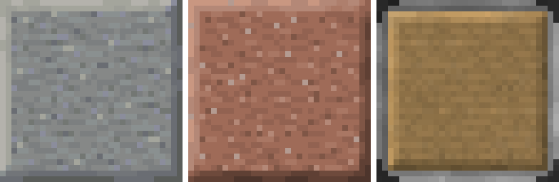
Contiguous stones that are not broken up into defined shapes should not have any added colors, and should be upscaled in a highly "painted" style, meaning that blobs of color shouldn't have definition added to them where none exists, and it should be upscaled in a very literal sense of being closer to a simple "demixelling" pass. However, avoiding jagged edges and keeping stylistic cohesion present with the rest of the textures is still important.
 Examples of contiguous stone textures. Note the lack of added detail and the plasticky look.
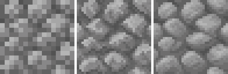
Rocky materials with distinct stones should first use added colors to define what is a rock and what is a gap before doing anything else. After this, upscale normally while ensuring that the gaps and the rocks are visibly separated and don't overly blend into each other using added colors. Always shape based on the rocks, and the gaps will follow based on the rocks and look natural as a result. Otherwise, the rocks won't look anything like rocks!
 Examples of textures with distinct rocks. Note the visible separation of the rounded rocks and gaps through added colors, particularly in comparison to their vanilla counterparts.
Small bricks and tiles should thin out the gaps to one pixel wide in the direction that looks best, and be upscaled normally from there. If the bricks have highlights or shadows, thin those out as well to one pixel wide. If the texture ends up looking flat due to the larger brick size after thinning out the gaps and highlights, added colors and even dithering sometimes may be helpful depending on the texture.
 Examples of small bricks and tiles. Note the one pixel wide gaps/highlights and slight usage of dithering.
Large bricks (and polished stones in certain situations) should leave the gaps, highlights, and shadows two pixels wide, and be upscaled normally from there. Depth shade the gaps and highlights, and for the gaps add a darker color as opposed to gems which add a lighter color. This helps give the gaps a 3d effect and makes the gaps a lot less flat and "AI upscaled" looking. If the bricks have a linear pattern, small amounts of linear dithering may also be helpful.
 Examples of larger bricks and polished stones. Note the usage of two pixel wide blended gaps, small amounts of linear dithering, but the overall painted look.
Polished stone/wood are the same as large bricks, only with the interior of the texture being tiled and the obvious tiling repetitions removed. However, only do this if it looks good, otherwise refer to the entry of large bricks if it has a "noisy" or nonvanilla appearance which is undesirable.
 Examples of polished stone and wood blocks. Note how the detail looks tiled and much more fine compared to vanilla, and the usage of two pixel wide blended gaps.
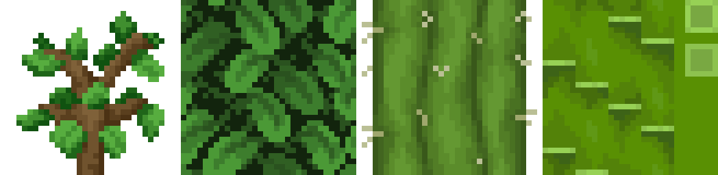
Tree bark and mushroom stems should have heavy amounts of antialiasing in the direction the texture goes added manually using added colors. This is primarily done to preserve the aesthetic of Vattic's original logs, which had an extremely glossy, almost motion blurred appearance and had no real reasoning for being so.
 Examples of heavily motion blurred logs. Note the usage of added colors going in the direction of the texture's linearity.
Planks and other refined wood should be upscaled with a lot of linear dithering and small amounts of antialiasing, to accurately portray a wood grain material. A method of doing this which is useful for planks involves stretching the vanilla texture, tiling it downwards, and fixing any awkward areas. Alternatively, if this method does not work well, simply extend out the detail to portray a linear look. Do not add colors unless absolutely necessary, and preserve default's contrast where possible.
 Examples of refined wood. Note the detailed and linear look.
Leaves and larger plants can use small amounts of dithering on the branches mixed in with a slightly increased usage of antialiasing and/or added colors. With thicker plants like cacti or bamboo, don't use any dithering and upscale conventionally.
 Examples of larger plants. Note the lack of any blending method on stalks and stems.
Flowers and other foliage can use dithering more heavily than leaves or stalks. Similar to rocky stones, ensure that flowers have a defined shape and don't overly blend into the stems or leaves, and depending on the flower type either dither or antialias. For plant stems, antialias heavily and thin them out. Vines should be evenly conventionally dithered throughout the entire texture, and use heavy amounts of antialiasing in addition.
 Examples of general foliage. Note the usage of dithering on the vines and on certain flowers, and how the flower stems were thinned out.
Grassy textures and certain fungi should use a "jumble" or "scramble" filter if your editing program has that, with a few edits to fix mixels and other visual issues. If it doesn't, manually dither it to give it a coarse texture. Keep the palette as close to vanilla as possible to preserve the contrast, sometimes you may want to use additional effects and index it back to the vanilla palette.
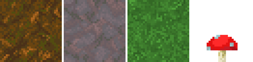 Examples of grassy textures. Note the usage of patchy dithering.
Sand and other powdery materials should tile the block in a 2x2 grid, then cut out random sections and rotate and/or flip them randomly to remove repetitions that stops the texture from looking just tiled on its own.
 Examples of powdery materials. Note the fine detail and how it looks almost tiled but isn't.
Sandstone should have large amounts of dithering present, a jumble tool may also suffice if necessary. Thin out natural gaps a lot more than otherwise, to give a more slate-like appearance. For more refined textures such as cut or chiseled sandstone antialiasing can also be used to properly convey smoothness.
 Examples of sandstone textures. Note the heavy usage of dithering, and heavy usage of antialiasing on polished blocks.
Prismarine should use added colors and antialiasing excessively to convey a smooth, shiny material. Thin out and curve highlights, and reduce gaps to one pixel wide.
 Examples of prismarine textures. Note the heavy reliance on antialiasing to prevent flatness, and the one pixel wide gaps and highlights.
Contrasty dirt and stone textures should soften the colors by using a translucent layer of the midtone color or manually editing the contrasty colors, and tile vanilla 16x on top of the texture at a low opacity using another different layer. However, only do this if the texture is particularly contrasty and the vanilla palette doesn't look good in any way even with added colors, as this method can add a lot of unnecessary colors and should be used as a last resort.
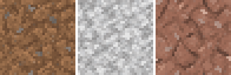 Examples of contrasty dirt and stone textures. Note the noisy look.
Icy and glassy textures should use antialiasing excessively. For items in particular, added colors should be used to properly convey a smooth surface. For textures with an obvious diagonal shine, thin out the shine marks and use antialiasing in the direction of the the marks to convey a streaky look, almost like diagonal linear dithering.
 Examples of glassy and icy blocks. Note the usage of antialiasing and added colors.
Fur and fabric should avoid false lines forming at all costs, which is very easy to happen given the spiky nature of these materials. Upscale it normally, and try to avoid having lines every two pixels from 16x by thickening and thinning out some of the spikes on the texture. Generally, the farther from the base color a spike gets, the thinner it should be. This creates a more natural effect and stops it from looking mindlessly upscaled.
 Examples of fabric and fur textures. Note the heavy usage of tapering lines and spikes.
Doors and trapdoors should be upscaled like what they are made of. However, doors should always use one pixel wide borders, while trapdoors can use two pixel wide blended outlines for the outer border. This discrepancy is due to Vattic's original wooden door and trapdoor having this inconsistency present.
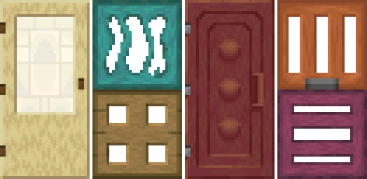 Examples of doors and trapdoors. Note the usage of depth shading on the trapdoors and one pixel wide lines on the doors.
And above all...
Always reference Vattic's art or other similar textures if possible first. Use these material guidelines only if there is no good reference point or equivalent!
Part 3: About Classic Faithful 32x PA
These guidelines have been heavily focused on the 32x Jappa pack. However, the Classic Faithful 32x Programmer Art pack follows a similar enough style and logic to not merit an entirely separate doc.
As new programmer art in the sense of art by developers of the game with little to no stylistic cohesion is no longer being developed, explaining how to upscale these types of textures in the same level of detail as the Jappa pack is unnecessary, given the pack being done in the first place. In addition, upscaling programmer art is very similar to upscaling Jappa, just dealing with larger palette sizes and taking questionable texturing decisions into account.
To get around this constraint of programmer art simply not being made anymore, the 32x Programmer Art pack is designed around the built-in vanilla programmer art resource pack, meaning any texture without a programmer art equivalent just reuses its Jappa counterpart. This solves the majority of problems surrounding how to interpret newer textures, by just using the texture that already exists.
While vanilla programmer art is deprecated and no longer updated, therefore leading to a lot of texture bugs, Classic Faithful in this regard takes liberties from the vanilla assets, but only to fix obvious oversights and eyesores that were forgotten by the developers.
Newer textures are not "progartified" to match older ones unless there is a direct reference and it is an obvious choice what to do, such as nylium using Jappa netherrack as a base.
Even though newer Jappa textures have a distinct style from programmer art, the exact way a developer would have gone about making a certain texture can't ever be known for sure, and it is not up to us to interpret. The aforementioned nylium and netherrack issue has a clear solution, to replace the Jappa netherrack with programmer art netherrack. However, a texture like blackstone has no clear programmer art equivalent, and as such shouldn't be touched and reuse the Jappa texture.
 Left: Nylium, an example of a texture that should be "progartified" to fix an obvious oversight in the vanilla programmer art resource pack. Right: Blackstone, an example of a texture with no clear programmer art equivalent and as such should not be changed from its Jappa base.
That being said, here's a section to help upscale any of the most different aspects of programmer art and Jappa art.
Part 4: Upscaling Noise and Blurriness
This is a very useful skill for anyone interested in programmer art to learn, and an essential for working on Classic Faithful 32x PA. Programmer art palette sizes oftentimes make conventional upscaling near-impossible by hand, and cutting corners is usually necessary to produce textures in a timely manner. These types of textures are also generally exceptions to the palette rule, in that you can add a significant number of colors, as color counts weren't really considered during the creation of vanilla programmer art textures.
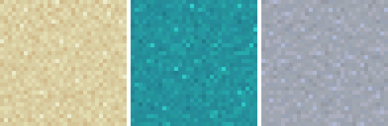
Noisy Textures
Noise is usually present on textures because they are an original, programmer art texture, or are placeholder visuals for a snapshot texture. The reason for noise in textures is generally due to a programmer having no idea how to properly draw pixel art and hiding whatever they made behind a mess of darker and lighter pixels to make it harder to see.
- Tiling with edits works very well if the texture is powdery or grainy, particularly when the texture is too chaotic and noisy to do it by hand. However, the most important part is to edit the texture after it's been tiled, or tiling repetitions will occur and it won't look good as a result.
 Left: The default texture. Center: The default texture tiled in a 2x2 grid. Right: Tiling repetitions removed.
- Jumbling, sometimes also called "scrambling", "diffuse", or just "randomize", is a method of automatically upscaling textures with a lot of noise, which you may recall is how you should be upscaling grassy textures. Essentially, it gets demixelled by shuffling the pixels around randomly near, meaning that color placement stays similar to default. However, this method has a very rough and almost patchy look and not all materials will support it.
 Examples of texture upscaling via jumbling.
- Tiled detail, which contrasty stone and dirt textures also use, however just without the contrast reduction. After doing a cursory upscale, likely using another method on this list such as bilinear or indexing, tile the same vanilla 16x texture you're upscaling on top of the texture at a low opacity using a different layer. This works best on dirty or very detailed textures however, as it has a very grainy appearance, similar to jumbling but even more detailed.
 Left: An automatically upscaled base. Center: The vanilla texture tiled. Right: The two overlaid on top of each other.
- Softening is effectively the opposite effect of tiled detail, in that rather than making it more contrasty and grainy, it makes it less so. Basically, rather than tiling default on top you put a heavily blurred version of the texture on top at a very low opacity, decreasing the contrast on the colors and softening the overall texture to look less sharp.
 Left: A base upscale. Center: The base upscale blurred. Right: The two overlaid on top of each other.
- Indexing and re-adding noise is a method where you index the palette down to a more reasonable size, upscale like normal or however the material should be shaded, then adding noise back and approximating the palette to something similar to what it originally was. On textures with defined gaps or other visible structures this is oftentimes the most viable option.
 Top right: The default vanilla texture. Top left: Indexed down to essential colors. Bottom Left: An upscale of the indexed version. Bottom right: Added noise back in, finished version.
- Natively upscaling is pretty much exactly what it sounds like, and by far the most difficult on this list. Simply upscale the texture as usual, while keeping the noise present and avoiding mixelly areas.
TIP
Many of the techniques listed here can work in conjunction with each other. You can even crop out certain areas of a texture and upscale them separately, effectively isolating areas of a texture from each other to make palette sizes more manageable and localized.
Blurry Textures
The majority of additional techniques for upscaling blurry textures are shared with noise.
- Automatic upscaling, such as a bilinear or bicubic upscaling filter rather than nearest neighbor and doing it by hand can oftentimes do the trick. As it tends to add a lot of additional transition tones, it fits blurry textures very well.
 Left: The programmer art bone block. Right: A bilinear upscale of said bone block.
Conclusion
Well, you did it and got through the whole thing. You should hopefully now have an actual idea of what Classic Faithful looks like and how it's done behind the scenes. If you have any questions or want something changed, make sure to let us know on our Discord Server.
Credits go to…
- The Faithful 32x guidelines by Pomi108, which this document drew heavy inspiration from.
- Written by Evorp.
- Edits by ZapPack.
- Images by various Classic Faithful contributors and Mojang Studios.