Appearance
The Faithful Texturing Glossary
Introduction
Faithful isn't without its specific jargon, from important names to broader pixel art-related texturing terms. Instead of having to constantly describe to new users who JAPPA is or what dithering means, we figured it would be easier to list them all out right here.
All Faithful texturing guidelines extensively reference terms found in this document, so it's recommended to read this before doing anything else.
Color Blending
Color blending refers to the method of transitioning one color into another, usually around the border of two colors. Different materials and styles will employ many different types of color blending, often at the same time.
No Blending
No blending is a simple border between two or more colors, without any additional effects. A work in progress texture tends to have no blending, as other blending methods are usually added later on. However, this tends to have a "plasticky" effect or look flat.
 Example of a color border with no blending method applied.
Banding
Color banding describes the phenomenon of noticeable stripes of a single color appearing as a result of using multiple colors for a transition. This goes hand in hand with having no blending methods being employed, but is generally undesirable for looking flat.
 Left: An example of noticeable color banding. Right: Most of the color banding removed.
Antialiasing
Antialiasing (AA) is a technique used to smooth the jaggedness of a pixelated border between colors by adding a thin layer of an additional in-between color. This is particularly useful for smoother textures or getting rid of harsh color borders, but is often employed in small amounts everywhere to eliminate harsh contrast.
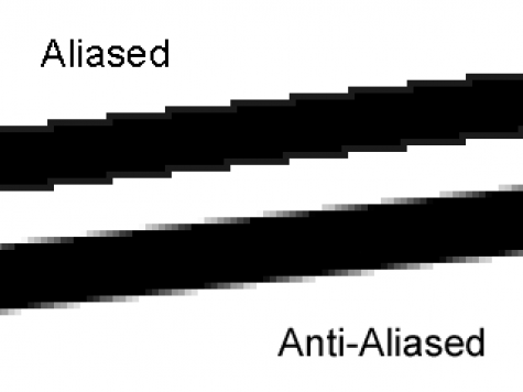 A line with no antialiasing compared to a line with antialiasing applied to it.
Dithering
Dithering, also known as regular or conventional dithering, is a technique where pixels of a color border are displaced in such a way that said border is no longer as sharply defined and has parts protruding in and out of the other color. It's commonly used for rough textures in the main Faithful packs and can be more generally used to add material definition to a texture.
 Example of regular dithering in a texture.
Checkerboard Dithering
Checkerboard dithering (also known as checkerboarding) is exactly what the name describes—a simple checkerboard between two colors. This is often used in stylized pixel art, but is usually not suitable for Minecraft textures as it looks very repetitive and unnatural.
 Example of a checkerboarded color border.
Linear Dithering
Linear dithering (LD) is just like dithering, but with longer and more directional displaced pixels as if regular dithering was stretched. This is frequently used for wood and wood-adjacent textures to mirror real-life wood grain, but can be applied in many different contexts as a smoother alternative to regular dithering.
 Examples of linearly dithered textures.
Wispy Dithering
Wispy dithering is a form of linear dithering, where instead of using single pixels to smooth out color transitions, small clusters of (often linear) pixels are used instead. Faithful 64x makes use of this extensively, as conventional dithering in higher resolutions can look undesirably grainy or fine.
 Regular dithering being converted to wispy dithering in Faithful 64x.
Depth Shading
Depth shading is an extremely versatile method of shading two or more pixel wide lines, frequently used by the Classic Faithful packs. Essentially, one shades a thicker line to make one side lighter and one side darker using a transition tone. The added color can be either lighter or darker than the base color depending on the texture's material. While this term was initially used just for gaps, it has expanded over time to include any two pixel wide line that can be shaded in this way, including highlights and ridges.
 Examples of depth shading in Classic Faithful.
Upscaling
Upscaling simply refers to changing the resolution of an image to be bigger. In Faithful-related contexts, upscaling generally refers to redrawing a vanilla resolution texture in a higher resolution (e.g. 32x or 64x). There are a few different types of upscaling.
Automatic Upscaling
Automatic upscaling (often referred to as AI upscaling, despite having nothing to do with AI) is an umbrella term for algorithmic based upscaling methods. Some examples of automatic upscaling algorithms are bilinear upscaling, XBR upscaling, and RotSprite upscaling. These methods are usually unsuitable for Faithful—at least in an unedited form—since these generalized algorithms aren't made for pixel art and result in blurry or flat textures.
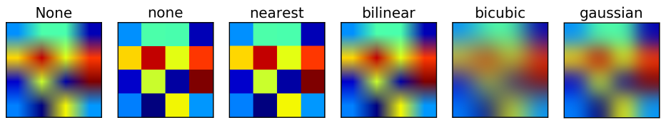 Different algorithmic upscaling methods.
Nearest Neighbor Upscaling
Nearest neighbor upscaling is a specific type of automatic upscaling where individual pixels retain their size relative to the canvas regardless of the actual resolution. This means the texture looks identical despite being physically bigger, and is a helpful base for manually upscaling the image in comparison with most other automatic methods.
 Left: The default texture. Right: 2x nearest neighbor upscaled texture.
Palette
In pixel art, a palette refers to the colors being used in an image. Since pixel art typically employs an intentionally limited palette, there are usually only a handful of colors in a Minecraft texture's palette.
Color Indexing
Color indexing, color quantizing, and limiting palettes (LP) are names for the concept of reducing the amount of colors in a texture to only necessary shades. This can either be done by hand or automatically using a program like GIMP or Aseprite. Textures with a limited palette generally have colors reused throughout the texture and noticeable color transitions.
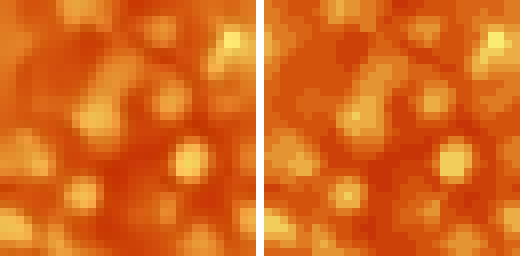 Left: Original texture. Right: Automatically indexed version of texture.
Noise
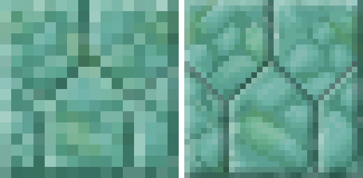
Noise, as opposed to a limited palette, is a filter which randomly brightens and darkens pixels to make a texture grainier, often used by novice pixel artists. In other contexts, it can mean a texture with no "definition", in that the detail has no meaning and is just a jumble of randomly placed pixels with no thought or reasoning behind them.
 Left: A "noisy" texture with an excessively large palette. Right: A random mess of pixels with no definition, which can also be called "noisy".
Contrast
Contrast is a method of classifying a certain color palette. High contrast means that the colors look very different from each other, and low contrast means the colors look very similar to each other. In more technical terms, it's the average distance between each color in perceived brightness. Pixel art tends to use higher contrast than more conventional art since the use of a limited palette restricts the number of available shades.
 The same texture with reduced and increased contrast.
Texturing Pitfalls
These are texturing mistakes so common we've come up with names for them.
False Lines
False lines are the occurrence of several elements and/or color areas of a texture lining up in such a way that they create an illusion of a straight line, even when there is none in reality.
 Example of false lines.
Mixels
Mixels (a portmanteau of "mixed-resolution pixels") are pixels of clashing resolutions. For instance, if a texture uses both 1x1 and 2x2 pixels interchangeably, that would be considered mixels.
 Example of mixels.
Stairing
Not to be confused with staring, stairing is a method of making lines and curves where each pixel moved the line is joined back to the previous one. While this can be employed in small amounts to create more natural looking gaps, it generally doesn't look good in large amounts and should be avoided.
 Left: Excessively staired gaps. Right: More varied gaps.
Art Styles
Jappa Textures
Jasper "JAPPA" Boerstra is the current art director for Minecraft, and was the lead artist from 2017 to 2022. He was also responsible for the 1.14 texture update, where the majority of the game's art was redone and polished with his style. These redone textures and any textures made after 1.14 by dedicated artists like him are often called Jappa textures in his honor.
Programmer Art
Programmer art, often colloquially referred to as "progart" or "PA", is an umbrella term that describes the textures and the general art style used in Minecraft before version 1.14. These weren't made by Jappa, or any real artist, but by the developers of the game.
Note that this term wasn't coined by Mojang, and outside of the Minecraft resource pack community it refers to placeholder visuals usually created by the programmers as placeholders for new features. This is what the pre-1.14 textures basically are, since many of the widely used ones were originally made by Notch in Paint.NET within a span of minutes.
 A programmer art texture and its equivalent Jappa texture.
Vattic
Vattic is the original creator of the Faithful 32x32 texture pack, and the lead artist from 2010 to 2016. His art style focuses heavily on layering and added color usage over more conventional pixel art techniques like dithering, and is the primary inspiration for the Classic Faithful packs.
 A vanilla texture and its equivalent Vattic texture.
Conclusion
If you think there's a term missing from here that's commonly used, let us know on our Discord Server—new terms are always evolving and this document will grow as needed. For further reading, we recommend the Blockbench Minecraft Style Guide.
Good luck texturing!
Credits
- Written by Pomi108 and Evorp.
- Images from Faithful contributors, Mojang Studios, and Google Images.
- Edited by Jamiscus, DMgaming, and Fred figglehorn.