Appearance
Faithful 64x Texturing Guidelines
Introduction
Faithful 64x is not the first 64x pack, and won't be the last. However, it stands out among many other vanilla-style HD packs by being high resolution without cutting corners. Over years, a specific style has become the generally accepted look for textures, but the rules for creating this style weren't stated anywhere clearly. To help achieve this consistent style and to maintain the standard of quality we have set out, this guide will teach you the specifics of dealing with large textures and what to do with them.
For simplicity, these guidelines will only add relevant details specific to upscaling to 64x. Make sure to read the Faithful 32x guidelines first, since most of the rules there apply here too.
Now, let's get started.
TIP
Many texturing and Faithful-specific terms are referred to throughout these guidelines. Make sure to read the Faithful Texturing Glossary if you run into any terminology you're unfamiliar with.
Use the Resolution to your Advantage
To put it simply, a 64x64 canvas is big. With this added space comes both advantages and disadvantages, which need to be addressed.
Added Detail
While 32x isn't a small resolution, some blocks and items can benefit from the additional space 64x offers to make the texture look closer to its real-life equivalent. For instance, the 64x fishing rod moves up the string like a real fishing rod would, which would not be possible in Faithful 32x.
This point is more about simply working with the resolution rather than against it, so remember not to go overboard with added details. The same goes for adding colours—try bringing in colours from other parts of the texture or dither harsh colour transitions instead of adding colours.
As a rule of thumb, if the detail you're adding would be possible in 32x without significantly compromising its look, the addition is probably too excessive.
Outlines and Highlights
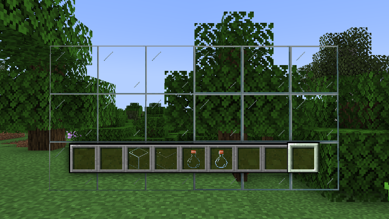
While the Faithful 32x guidelines emphasizes using one pixel wide highlights and shadows for textures, this can have problems in 64x with both visibility and rendering. Glass can turn completely invisible on small screens with a one pixel wide outline in 64x, so using a two pixel wide shaded outline is better in these circumstances.
 One pixel wide versus two pixel wide gaps. Note how the thinner outlines become nearly invisible in-game.
Exceptions can also apply to blocks with defined gaps, such as stone bricks. Thin gaps can make the texture look flat or unrealistically proportioned at times, but highlights don't have this issue. Therefore, using smaller highlights and bigger gaps ends up looking the best in this scenario, despite the 32x reference texture having the same width for both.
Above all, get feedback from others about using a one pixel versus two pixel wide outline, since it can vary from texture to texture.
Mob Faces
The Faithful 32x guidelines go into depth about not upscaling mob faces, but in 64x there's a lot more space to experiment. Many eye shapes that don't work well in 32x can become viable in higher resolutions since there's more space to add realistic detail.
The same rule about keeping a "mixel face" if no options look particularly good still applies, but try different options and see if any look good first.
Materials
Just like in Faithful 32x, different materials are shaded in different ways. Some of these materials are different between the two resolutions, but the same principle applies: you wouldn't shade coal as you would a bucket.
Dithering
Dithering in Faithful 64x works differently to dithering in Faithful 32x. Conventional dithering often used in Faithful 32x can become very noisy in 64x since each displaced pixel is so small, and the texture usually ends up looking more fuzzy than rough.
To get around this, Faithful 64x heavily relies on a form of linear dithering often colloquially called "wispy" dithering. Instead of using single pixels to smooth out colour transitions, small clusters of pixels are used instead. These clusters usually face in the same direction, giving a slight linear look to the texture.
Do note that other types of dithering can still be used, and there are occasions with particularly rough textures where conventional dithering can be used as well.
General Material Reference
This is a much more general reference than the Faithful 32x guidelines, since the same guiding principles apply here as well. The only difference is in the execution of each material, since many techniques commonly used in 32x don't work well in 64x and vice versa.
Metal and polished gems should use no dithering of any type.
Smooth-ish textures should not use any lone pixels with dithering, but can have additional linear detail to fill empty spaces.
 Examples of somewhat smooth textures.
Hair and fur should use a combination of wispy and conventional dithering, to portray a messy and chaotic surface accurately.
 Examples of hair and fur.
Stone, planks, and other rough textures should use both linear and wispy dithering, but not much conventional dithering.
 Examples of rough, natural textures.
For materials not explicitly stated here, follow their 32x equivalents where possible. In particularly difficult cases, you can also ask the original author what their intent was, something not possible in 32x.
Conclusion
Hopefully, this guide has helped you with creating your own 64x textures. If you want to suggest anything to add, change, or remove to these guidelines, let us know on our Discord server.
Credits
- Content by HARYA_
- Additional edits by Evorp
- Images by various Faithful 64x contributors
